
Context
Ricordi is a Yorkshire-based high end events company that creates, project manages and delivers luxury occasions for clients who want something truly bespoke.
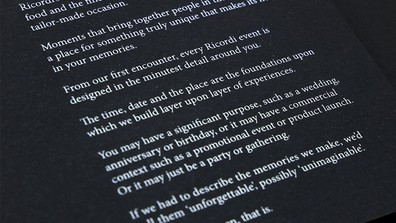
Their proposition is firmly entrenched in the belief that the very best events are created in the imagination and delivered by their team of chefs, hospitality specialists, location scouts, lighting and set designers and an army of people obsessed with detail, detail and more detail. No stone is left unturned and no sensory pleasure is left neglected.
Touch, taste, sight, sound and smell are part of a complete multi-sensory experience. In essence, this is a company that creates unforgettable moments and events based on starting with a blank sheet of paper and head full of ideas. The possibilities are endless.
The Brief
Ricordi clients know that they’ll be investing in a premium service which is bespoke from start to finish, so the ‘sell’ is a consultative one that starts with a conversation, and continues until a scheme is designed and mapped out in forensic detail.
The challenge for Applied, therefore, was to create a brochure that explored a myriad of possibilities based on, if you like, a forward projection of the memories a client might want to make.
Our creative solution
At the start, it was clear from the brief that this whole luxury sector is fraught with cliché, stereotype and over familiar narrative tropes that sound like everything else. The typical bronze, silver, gold and platinum hierarchy of ‘bespoke’ packages was also a no-no. The challenge was to take their clients on a journey of suggested possibilities covering a range of occasions where someone, or a company, might want to host an event that, by its very design and composition, became a day, afternoon or evening to remember.
For Ricordi clients, while price may not be an issue, they wanted to be seen as a luxury events company with both the experience and emotive intelligence to be entrusted with creating something precious, unforgettable and unique. No two Ricordi events are ever the same.
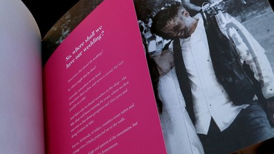
So, with art direction from Mike McGowan, Appiled’s Creative Director, we created a premium quality brochure which was designed to be a masterpiece in understatement, while a game changer in terms of narrative. We even dispensed with a ‘Welcome’ page.
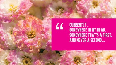
“Your ultimate event or occasion unwrapped. So many possibilities. So many ideas. Here’s just a handful”.
The brochure belly wrap, featuring a discreet ligature ‘r’ logo for Ricordi (imagine the repeat design of a Hermes tie) was designed to set out an intriguing proposition without giving the game away. This was enhanced with a new company strapline “Memories worth sharing”
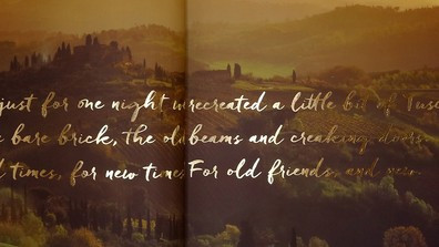
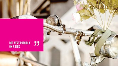
“What we wanted to do was set out a visually striking brochure based around a series of suggested narratives linked to possible events. These included an evening reception in a Ferrari garage, an anniversary in a converted Cotswolds barn to evoke an evening in Tuscany, and a wedding in a bike shop for a cycling-obsessed couple. But the trick with both the design and the narrative was to link the location to the memories the event would create, and not fall into the trap of over-selling the detail. We wanted to sell the idea of the memories each event would evoke.”
From an art direction point of view this approach enabled Mike to focus on weaving in various aspects of the Ricordi brand identity (also created by us) into clever visual devices – almost as a way of establishing the Ricordi stamp of perfection on each event. For instance, champagne corks were stamped with the Ricordi logo, while a cluster of Italian lemons included one affixed with a Ricordi lemon country of origin sticker. Even the sleeves of the cycling jersey, projected onto the couple celebrating their wedding, had ‘Ricordi’ woven onto their sleeves.
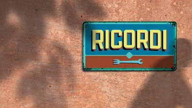
Visual tricks like a vintage enameled ‘Ricordi’ sign on the side of a terracotta wall, or a fork and spanner to denote dinner in a garage, showed how we created a brochure full of fun and whimsy, without falling into the trap of being overly poetic or romantic.
Tom Warman, Applied copywriter, explains…
“This project was a classic example of an art director working in close collaboration with a wordsmith to create a brochure that challenged convention through clever storytelling – through deftly crafted art direction and a captivating, relatable narrative. Ultimately, the Ricordi brochure is about telling stories, and helping the company sell possibilities – starting with a blank sheet of paper.”
And when it came to taking our masterpiece from computer to print, we were equally particular about the details.
“We wanted this book to feel as good as it looks. Selecting the correct stocks of paper and card is a careful balance between how it will feel to the touch and how the ink will respond to the surface. An uncoated paper stock will, for example, allow the ink to to be drawn into its fibres, producing a warm, natural print finish. Also to consider were the numerous finishings such as foil blocking, die cutting and embossing - all of which contribute to the tactile nature of the book and the physical experience of the Ricordi brand - so the weight of the stock needed to be matched with the process.
After testing several samples, we specified Fedrigoni paper and card as our stock of choice. Sirio Black 290gsm for the cover, Arcoprint uncoated 250gsm for the primary sections and 150gsm Novatech Silk for the section tip ins. The book was perfect bound with a fold out cover featuring white foil block logos and text.
The result, we believe, was a brochure which absolutely subverts the standard language deployed to sell high end events. With not so much a mention of the word “luxury”.”